For my hall of shame entry, I would like to nominate WebReg. It has irritated me from the first day I tried to sign up for classes, and it hasn't gotten better since. It serves a function that most people use only three times a year, for about four years. Because of this, it has given me plenty of time to forget its idiosyncrasies between registration periods. Every time, I have to partially relearn the structure, the process, and the pitfalls to avoid. The system is not obvious to new users, and it doesn't represent the most efficient way to sign up for classes, even for returning students.
First impressions are key, as usual. Upon logging onto TritonLink, the user is presented with the following screen:
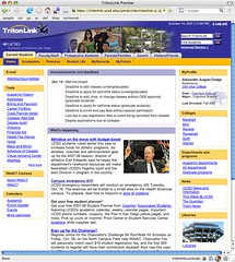
This is a cacophony of information. There's two announcement blocks, one for deadlines and one for school news, no less than eleven tabs at the top of the page, some kind of alphabetical index at the bottom (which I'd never even seen until I started writing this essay), and ten boxes of links. The links are named in a way that doesn't make it obvious what you're going to be taken to when you click them. The mood of the page is best described as hectic, with a real designed by committee feel to it. The most indicative part of the page being the UCSD Emergency Status indicator.

I cannot think of a reason for anyone to need or want to know that we are experiencing a normal level of emergencies. If there was a more severe emergency, and the only way UCSD could get the word out was via the website, I would hope it would manifest itself as more than a differently colored triangle below the fold of the main page of Tritonlink.
So, the next step, in my mind, is to click on the academics tab. Clearly, adding a class is an academic subject. The user then sees this block, prominently located on the next page.

The obvious next move is to click on “Add/Drop/Change.” However, instead of being directed to the Add/Drop/Change function of the site, the user is instead given a list of help topics regarding class changes. There's two topics, “How to Enroll in Classes” and “How to Add a Class.” The user picks the first one, because it's first, and is show the following guide:

Notice how the third step for the “How to Enroll” instructions is “Enroll.” This action was obvious to the person writing the instructions, though I have no doubt that this was one of the same people involved in the original WebReg project. I experienced much frustration and infuriation the first time I had to sign up for classes, and again to lesser degrees each time I've had to do it.
There's more to the painful learning process, but eventually the user understands that the enrollment process is divided into two applications: One for finding a class to enroll in (Schedule of Classes) and one for enrolling in it (WebReg). As a result of this, the user has to keep switching between the two applications. For a novice computer user, this means actually navigating back and forth between two sections of the website. Even for an advanced computer user, comfortable with keeping multiple windows open and using them, this is a ridiculous situation.
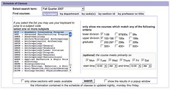
The problem is compounded by the fact that the Schedule of Classes application doesn't talk to the database of class assignments. The only way to know if a class you're looking at conflicts with a class you've already signed up for is to either sign up for it and click the “Weekly Planner” button and check for conflicts or keep yet another window open with your schedule. There's also no indication of which classes will be helpful for the user to graduate. This shows the interface for searching for classes, which lacks an option to simply show classes that will help, instead overwhelming the user with a variety of search options for every possible situation.
The university, college, and major requirements are all on separate pages in other parts of the website, each of which will probably need to be referenced during the enrollment procedure.
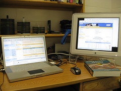
This shows my setup for enrolling for classes. I have, in various windows, WebReg, the Schedule of Classes application, the Cognitive Science major requirements, the Muir college graduation requirements, the UCSD Graduation requirements, a list of classes I've taken before, and a calendar showing the classes I've signed up for so far this quarter. Even with two screens, I still have to shuffle through windows to organize my thoughts.
If I was tasked with recreating the class enrollment system for UCSD, I would integrate these two applications and create a smart wizard for picking classes that will help toward your degree. There would also be a more prominent “Enroll in Classes” button on the main Tritonlink page, and class search results would be tagged with what requirements they satisfy as well as whether they conflict with classes you've already enrolled in.
So, in conclusion, WebReg and its sister application Schedule of Classes are accepted only because people have gotten used to them. New students have a hard time grasping the system, and even returning students would benefit from a more streamlined system.

